Visualizing electromagnetic fields from sparse measurements
Background
As part of Lightwork Home Health’s assessments, we measure the electromagnetic fields in people’s homes (see a prior article for some background on “EMFs”).
We investigate several types of electromagnetic fields, and for each of them, we’ve found that visualizing the field is a powerful tool for both analysis by our team and for conveying the impact and remediation options to the customer.
Unfortunately, it’s hard to visualize these fields. In general, EMF measurement devices take a measurement at a specific point, which doesn’t easily translate to a fuller picture of what’s going on across the whole room or home. It’s not terribly useful to spew a bunch of numbers at someone (“87,000 microwatts per meter squared! 3.7 milliGauss!”).
We are serious about breaking new ground and pushing environmental toxin assessments beyond the current state-of-the-art. That’s the whole reason we started the business: to provide scientifically grounded, quantitative results while being open-minded and on the bleeding edge. So we look at every single detail and wonder, “how could we be more rigorous about this?”
So we created what we believe is a first in the home health assessment industry: a custom app that creates a 3D representation of the home, allows us to log data points at specific points in that 3D space, and then — for EMF-related data — interpolates between those data points to build a visualization of the field. It ends up looking something like this:
Much easier to understand than just some point-in-space numbers! Plus you can see how the field will change if you implement certain interventions.
The process
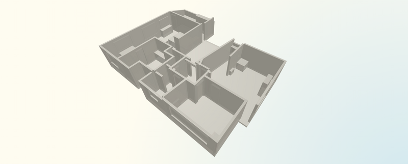
When we use this process, we first build a 3D scan of the home via our app:

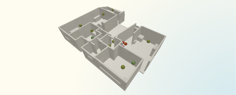
Then we go around with our measurement devices and log data points in that space (this is just an example):

But then you run into the next problem, which is: from a relatively sparse set of measurements throughout the home, how can you approximate a visualization of the field that conveys more fully what is going on? Of course, these electromagnetic fields exist at every point in space, but we can’t measure every point — so interpolating and approximating is the best we can do.
We’ve iterated through a couple progressively-more-accurate methods for this interpolation, but we’re quite proud of our latest version, and so thought I would write this up. We will continue to relentlessly improve all this, so if you have any suggestions, please email me.
There are lots of nuances for each type of electromagnetic radiation we measure — near-field vs. far field dynamics; wall and other barrier interactions; measurements like RF power density that fluctuate meaningfully even at single points in space; field orientations; and much more.
So for purposes of this post, I will focus on the “simplest” case, which here is Extremely Low Frequency Magnetic (ELF Magnetic) fields. These are measurements (in milliGauss) of magnetic flux density in the 50Hz-120kHz frequency range, typically caused by power lines and power distribution infrastructure, unbalanced circuits and wiring errors, plumbing current, and related issues. I will reserve further discussion of the details of these fields and others for another post, and instead focus on the modeling.
How to draw a field
The problem statement: we have a scan of a home with a series of point-in-space milliGauss measurements of the magnetic flux density — like in the image above.
We now want to interpolate between them to build out a field approximation and visualization.
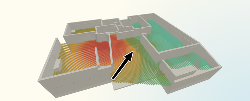
There are some obvious approaches you might jump to first (and we did) — perhaps simple inverse distance weighting or treating the data points as sources/emitters, clustering them, and then summing their impact on a given point based on their distance from it. These can work out fine, but there are ways to be more precise — and the simpler methods tend to run into weird edge cases where they don’t model the field well.
For example, here’s a clustered emitter-based model with some distance falloff. See where the arrow is pointing to? Doesn’t look plausible! Way too sharp of a change based on our experience assessing these fields and simple physics intuition.

So where to look? How can we model these fields more accurately?
The first realization that you need to make is that it is simply not possible to perfectly reconstruct a complete field from a sparse set of datapoints in a situation like the one we have. There is a massive loss of information when you compress from “field with value at every point in space” to “dozens of samples taken throughout home.” So we need to be comfortable with some uncertainty in the reconstruction.
And if you accept that uncertainty, the natural next step is to wonder if there are statistical methods — i.e. methods that inherently incorporate uncertainty or probabilities — for doing such a thing. And once you search around for that, you’ll find the field of geostatistics, which is a branch of statistics specifically focused on data with spatial or spatiotemporal components. It’s often used in geological contexts, but can certainly be applied here.
And once you find geostatistics, then you’ll realize that one of its core tools is something called kriging. From Wikipedia:
Kriging is a group of geostatistical techniques to interpolate the value of a random field (e.g., the elevation, z, of the landscape as a function of the geographic location) at an unobserved location from observations of its value at nearby locations.
This sounds like exactly what we want! We can use kriging to interpolate the value of the magnetic flux density at every point in the home, most of which were “unobserved,” from observations of its value at nearby locations (the samples we took).
The long and short of it: that’s roughly what we do.
Before we get into the math (which you need not read!), here’s one way to try to understand the intuition behind how this model works:
First, it breaks up the entire 3D space of the home into arbitrarily-sized “voxels” (think: pixels, but 3D). We can adjust the size / density of these voxels in our interface when doing analysis.
Then it places each of the data points we collected into the closest voxel. Each of these points has a value (in milliGauss), but for ease of mental visualization you can think of them as being different colors. So now we have the map of the home, with some scattered points that might be green (low reading) or red (high reading), or anywhere on the scale.
The model’s job now is to draw the “most likely” pattern of colorings across all the voxels in the space that would “pass through” each of the existing data points.
What does “most likely” mean? Well — imagine you’re looking at a room, and on one side of the room you have a couple green (low value) points, and on the far side of the room you have a couple yellow (moderate value) points, and nothing else. If you were trying to draw what goes in between, it would be very surprising if you suddenly saw a bunch of red. There’s nothing to indicate that! So perhaps the “most likely” pattern would be a smooth gradient going from green to yellow.
This obviously gets more complicated in the real world — there are many competing sources of radiation, data points can be noisy, and there are a whole lot of other challenging factors. But kriging formalizes this “what is most likely” question and outputs a value for each point, as well as a confidence level. It effectively assumes that the “true” field is a smooth surface without discontinuities and finds the most probable field.
In order to use the methods, we tell the model two things:
- How quickly the field tends to change with distance. This allows us to encode our specific physical knowledge of the behavior/characteristics of the type of field we’re looking at. In statistics-speak, this is called the “kernel” or “covariance function.” In practice, it is a formula that encodes ideas like “points within two meters of each other are usually similar” or “moving straight up doesn’t change the reading much, absent other information”
- How noisy the data points might be. Measurements aren’t perfect and there are lots of factors that play into that moment-in-time/moment-in-space measurement. Kriging keeps what is called a “nugget” — sort of “wiggle room” — around each data point so one bad reading doesn’t cause an aberrant spike.
Once those rules are set, kriging can be thought of as roughly attempting to create all possible smooth, continuous fields consistent with the data (i.e. all colorings of the space that smoothly “pass through” the data points we collected), and finding the statistically optimal blend (a.k.a. the best linear unbiased prediction, or BLUP) along with a confidence interval for each point.
We have developed a Lightwork Exposure Index for each of these facets of exposure (perhaps more on that in a future post!). For each facet, exposure levels are mapped to an AQI-like scale that goes from Optimal to Good, then Moderate, Unhealthy for Sensitive Groups, Unhealthy, and Very Unhealthy. Each of these has a color associated with them.
So our interface then converts each value to a color based on where it falls in our Lightwork Exposure index scale (blending between tier colors appropriately). And then it draws it all!
What our analysts and customers end up seeing is the visual manifestation of all of that.
We’ve looked at how this performs relative to actual held-back measurements, and it is… really quite impressive. So we’re excited to use it to give people an understanding of what’s going on in their homes! Here’s the example video again:
If you want some more math behind it… read on. Otherwise you are welcome to leave the page (or check out Lightwork Home Health)!
The math
This section is for readers who care about the exact statistical model and equations. You don’t need any of this to understand the rest of this post above!
In summary: we’re using an simple kriging system (with mean estimated from the data) in log-space with an anisotropic exponential kernel whose per-assessment length scales are derived from the scan of the home.
We start with log-domain observations — for each sample location with milliGauss reading , we work with:
This is just a simple stabilized log-transform (based on our understanding of physical perception/effects of these fields — they are more multiplicative than additive, and orders of magnitude appear frequently and matter) that keeps zero/near-zero readings finite.
We assume a constant prior mean . This means we’re doing “simple kriging,” albeit with an empirically estimated mean that varies assessment-to-assessment. I think it’s almost like ordinary kriging, although that is a slightly more complex approach that enforces unbiasedness constraints.
We then want to consider that, based on how we take measurements, we probably want to allow different degrees of variance / “stretchiness” in different dimensions. Most of our readings are taken at chest/head height, and we only take more vertically-sensitive readings in specific cases. So that leads us to wanting to encode the idea that horizontal variation can be tied to the survey footprint, and we can leave vertical variation a bit smoother since we are sparser in that axis (which in our convention is the axis). We also want a nonzero measurement noise floor.
So we fit anisotropic length scales (i.e. length scales that vary depending on the dimension you are considering) based on the bounding box of all points. For now, we use roughly the following values, but will continue to iterate as we collect more data: , , , with variance and nugget .The reason we are using length scales that are relative to the size of the home for now (even though these fields physically behave the same way anywhere) is that in general, the number of data points collected scales sub-linearly with home size, which means larger homes have sparser data — and so we want to fortify against the modeled field changing too quickly in those situations.
Also, note that these parameters can shift depending on the nuances of the type of radiation we are measuring — as noted above, what I’ve written up is our current approach for ELF magnetic fields specifically.
In simpler terms, these roughly say:
- over 1/6th of the house width or depth, correlations can drop quite a bit
- the vertical direction models slower changes than horizontal ones (typically 1.25x the previous term)
- we’re normalizing so log-values are “order 1”
- we assume ~0.05 variance of noise around each data point
Then we look at an exponential covariance kernel — given positions , we rescale the differences and use the kernel:
This basically just answers the question: how much does each measured data point affect each specific point in the home? If they are close together, it is a strong effect. If they are far apart, it isn’t. And this takes into account the anisotropy we just defined, so the magnitude of effect isn’t just the “crow flies” distance, but varies based on the actual dimensional lengths between the points.
On the diagonal we add the nugget: , which prevents singular matrices and accounts for sensor / data collection noise. The “diagonal” of that matrix is each data point’s covariance with itself. But if we want to build for the reality of measurement noise (and make our upcoming inversion easier), we need a little wiggle room on each of those, which otherwise would just be 1. So we add the nugget to each.
After all that setup it is time to solve the kriging system! More formally, we let be the covariance matrix with entries . Centered observations are . This all encodes how much each pair of observations co-vary according to the kernel we just defined, and moves to “zero-mean” world, where we’re modeling the residuals of how much the observed log value is above or below the mean.
We solve:
which gives the kriging weights .
is a vector of weights, one per observed point, which basically suggest how much each data point should influence the predictions relative to each other. This comes out of the “Gaussian Process” (basically the generalized form of kriging), where the best linear unbiased predictor (BLUP) can be written as a linaer combination of observations, and the coefficients in that combination are the s.
So it’s finally time to make some predictions! For a voxel centered at , we build the cross-covariance vector
This answers, for the voxel we’re looking to predict, how similar it should be to each data point.
The kriging mean in log space is then
This is the big payoff — we take the baseline log-level value, and add to it the weighted influences of all points on the voxel we’re trying to predict. Basically: sum up all the influences of all points on the to-be-predicted one, weighted by both global importance and how close it is (anisotropically), and add to the mean (note it may end up above or below the mean! The combination term is not always positive.).
And the kriging variance (before clamping) is
We then back-transform from log-space to get back to physical measurements that we can display: .
Our interface then colorizes based on where it falls in that facet’s Lightwork Exposure Index scale. We also optionally expose as a confidence measure for our analysts for the field at each point, which manifests as the opacity of the point in the visualization.
Net of everything, we get a very robust visualization of the fields from a pretty sparse set of measurements! Clients and partners love it, and our team finds it very useful for proposing and explaining remediation options.
If there are any geostatistics folks reading this and you have ideas for how to improve this, I’m all ears!
Looking for more to read?
Want to hear about new essays? Subscribe to my roughly-monthly newsletter recapping my recent writing and things I'm enjoying:
And I'd love to hear from you directly: andy@andybromberg.com